UI Layer Parameters
The UI Layer controls how things look — images, text, colors, buttons, visibility. Changes apply instantly in the dashboard preview. This layer is auto-scanned from your playable's
The UI Layer is available directly in the dashboard. Every visual component can be customized instantly — no approval required.
What is the UI Layer?
The UI Layer controls how things look — images, text, colors, buttons, visibility. Changes apply instantly in the dashboard preview. This layer is auto-scanned from your playable's Canvas hierarchy.
| ComponentParameter | Cocos Component | What It Controls |
|---|---|---|
| SpriteComponentParameter | cc.Sprite | Images, icons, backgrounds, tint colors |
| LabelComponentParameter | cc.Label | Text content, fonts, colors, outline, shadow |
| ButtonComponentParameter | cc.Button | Interactive buttons with transitions and states |
| UIOpacityComponentParameter | cc.UIOpacity | Transparency and fade effects |
| UINodeComponentParameter | cc.Node | Visibility, position, rotation, scale |
| UITransformComponentParameter | cc.UITransform | Content size and anchor |
| WidgetComponentParameter | cc.Widget | Anchoring and alignment |
| ProgressBarComponentParameter | cc.ProgressBar | Progress indicators |
| SliderComponentParameter | cc.Slider | Slider controls |
| ToggleComponentParameter | cc.Toggle | Checkbox/toggle states |
| LayoutComponentParameter | cc.Layout | Auto-layout settings |
| MaskComponentParameter | cc.Mask | Masking effects |
| CameraComponentParameter | cc.Camera | Camera position, FOV |
SpriteParameter
Controls any image element attached to a cc.Sprite component.
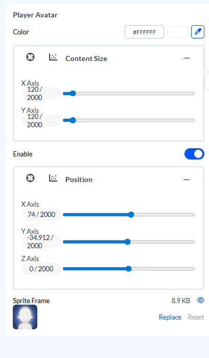
Properties (ALL fields included by default)
| Property | Config Key | Type | Description |
|---|---|---|---|
enable | enable | BooleanParameter | Show or hide node |
position | position: {x, y} | CoordinatesParameter | 2D screen position |
contentSize | contentSize: {x, y} | CoordinatesParameter | Width and height |
scale | scale: {x, y} | CoordinatesParameter | Size multiplier |
spriteFrame | spriteFrame: "" | ImageParameter | Image asset (PNG/JPG) |
color | spriteColor: "#FFFFFF" | ColorParameter | Tint color overlay |
spriteFrame
Upload or replace the image.
| Requirement | Value |
|---|---|
| Format | PNG (transparent) or JPG |
| Max size | 2MB |
| Recommended | 512x512 for icons, 1920x1080 for backgrounds |
spriteColor
Tint overlay applied to the image.
| Value | Effect |
|---|---|
#FFFFFF | No tint (original colors) |
#FF0000 | Red tint |
#00000080 | 50% black overlay (darken) |
position
Screen coordinates from the node's anchor point.
{x: 0, y: 0}      → Center (if anchor is 0.5, 0.5)
{x: -200, y: 100} → 200px left, 100px up from center
scale
Size multiplier. {x: 1, y: 1} = original size.
{x: 2, y: 2}    → 2x larger
{x: 0.5, y: 0.5} → Half size
{x: 1.5, y: 1}  → Stretched horizontally
LabelParameter
Controls any text element attached to a cc.Label component.
Properties (ALL fields included by default)
| Property | Config Key | Type | Description |
|---|---|---|---|
enable | enable | BooleanParameter | Show or hide |
position | position: {x, y} | CoordinatesParameter | 2D screen position |
contentSize | contentSize: {x, y} | CoordinatesParameter | Text box size |
string | string: "text" | TextParameter | Display text content |
color | labelColor: "#FFFFFF" | ColorParameter | Text fill color |
fontSize | fontSize: 48 | NumberParameter | Font size in pixels |
lineHeight | lineHeight: 0 | NumberParameter | Line spacing (0 = auto) |
isBold | isBold: false | BooleanParameter | Bold style |
isItalic | isItalic: false | BooleanParameter | Italic style |
isUnderline | isUnderline: false | BooleanParameter | Underline decoration |
outlineColor | outlineColor: "#000000" | ColorParameter | Text outline color |
outlineWidth | outlineWidth: 0 | NumberParameter | Outline thickness (0 = none) |
shadowColor | shadowColor: "#000000" | ColorParameter | Drop shadow color |
shadowOffset | shadowOffset: {x, y} | CoordinatesParameter | Shadow offset position |
string
The text content displayed.
"Download Now"
"Level 1"
"Score: "
labelColor
Text fill color in hex format.
| Format | Example |
|---|---|
| Solid | #FFFFFF |
| With alpha | #FFFFFF80 (50% transparent) |
fontSize
Font size in pixels. Typical values:
| Use Case | Size |
|---|---|
| Headlines | 60-80 |
| Body text | 36-48 |
| Labels | 24-32 |
| Small text | 18-24 |
Outline
Text outline for readability against busy backgrounds.
| Property | Value | Effect |
|---|---|---|
outlineColor | #000000 | Black outline |
outlineWidth | 0 | No outline |
outlineWidth | 2 | Thin outline |
outlineWidth | 4 | Thick outline |
Shadow
Drop shadow for depth.
| Property | Value | Effect |
|---|---|---|
shadowColor | #000000 | Black shadow |
shadowOffset | {x: 2, y: -2} | Bottom-right shadow |
shadowOffset | {x: 0, y: 0} | No shadow |
ButtonParameter
Controls interactive buttons. Extends SpriteParameter with label prefix fields.
Sprite Properties (Button Background)
Inherits ALL SpriteParameter fields:
| Property | Config Key | Type | Description |
|---|---|---|---|
enable | enable | BooleanParameter | Show or hide |
position | position: {x, y} | CoordinatesParameter | Button position |
contentSize | contentSize: {x, y} | CoordinatesParameter | Button dimensions |
scale | scale: {x, y} | CoordinatesParameter | Size multiplier |
spriteFrame | spriteFrame | ImageParameter | Button background image |
color | spriteColor | ColorParameter | Background tint |
Label Properties (Button Text)
Additional label prefix fields:
| Property | Config Key | Type | Description |
|---|---|---|---|
labelString | string: "Play" | TextParameter | Button text |
labelColor | labelColor: "#FFFFFF" | ColorParameter | Text color |
labelFontSize | fontSize: 36 | NumberParameter | Text size |
labelLineHeight | lineHeight: 0 | NumberParameter | Line spacing |
labelBold | isBold: false | BooleanParameter | Bold style |
labelOutlineColor | outlineColor: "#000" | ColorParameter | Text outline |
labelOutlineWidth | outlineWidth: 0 | NumberParameter | Outline thickness |
UINodeComponentParameter
Maps to cc.Node. The base building block for any scene node — visibility and transform.
Properties
| Property | Config Key | Type | Description |
|---|---|---|---|
enable | active | BooleanParameter | Show or hide the node |
position | position: {x, y} or {x, y, z} | CoordinatesParameter | Node position |
rotation | rotation: {x, y, z} | CoordinatesParameter | Rotation in degrees |
scale | scale: {x, y} | CoordinatesParameter | Size multiplier |
UITransformComponentParameter
Maps to cc.UITransform. Controls the size and anchor of a UI node.
Properties
| Property | Config Key | Type | Description |
|---|---|---|---|
contentSize | contentSize: {x, y} | CoordinatesParameter | Width and height |
anchor | anchor: {x, y} | CoordinatesParameter | Anchor point (0–1) |
Together, UINode + UITransform replace the older single
TransformComponentParameter. Every UI element is composed from these two plus its component (Sprite, Label, Button, …).
CameraComponentParameter
Maps to cc.Camera. Controls camera nodes.
Properties
| Property | Config Key | Type | Description |
|---|---|---|---|
position | position: {x, y, z} | CoordinatesParameter | Camera position |
rotation | rotation: {x, y, z} | CoordinatesParameter | Camera rotation |
fov | fov: 45 | NumberParameter | Field of view (degrees) |
UIOpacityComponentParameter
Maps to cc.UIOpacity. Controls transparency.
Properties
| Property | Config Key | Type | Description |
|---|---|---|---|
opacity | opacity: 255 | NumberParameter | Opacity 0-255 |
WidgetComponentParameter
Maps to cc.Widget. Controls anchoring and alignment.
Properties
| Property | Config Key | Type | Description |
|---|---|---|---|
top | top | NumberParameter | Top anchor distance |
bottom | bottom | NumberParameter | Bottom anchor distance |
left | left | NumberParameter | Left anchor distance |
right | right | NumberParameter | Right anchor distance |
alignMode | alignMode | SelectParameter | Alignment mode |
ProgressBarComponentParameter
Maps to cc.ProgressBar. Controls progress indicators.
Properties
| Property | Config Key | Type | Description |
|---|---|---|---|
mode | mode | SelectParameter | Bar mode (horizontal/vertical) |
totalLength | totalLength | NumberParameter | Bar length |
progress | progress: 0.5 | NumberParameter | Progress value 0-1 |
reverse | reverse: false | BooleanParameter | Reverse direction |
SliderComponentParameter
Maps to cc.Slider. Controls slider inputs.
Properties
| Property | Config Key | Type | Description |
|---|---|---|---|
direction | direction | SelectParameter | Slider direction |
progress | progress: 0.5 | NumberParameter | Slider value 0-1 |
ToggleComponentParameter
Maps to cc.Toggle. Controls checkbox/toggle states.
Properties
| Property | Config Key | Type | Description |
|---|---|---|---|
isChecked | isChecked: true | BooleanParameter | Checked state |
interactable | interactable: true | BooleanParameter | Can interact |
ColorParameter
Standalone color value.
Format
| Format | Example | Notes |
|---|---|---|
| Hex (solid) | #FF5722 | Full opacity |
| Hex (alpha) | #FF572280 | 50% opacity (80 hex = 128/255) |
Alpha Values
| Hex | Decimal | Opacity |
|---|---|---|
FF | 255 | 100% |
CC | 204 | 80% |
80 | 128 | 50% |
40 | 64 | 25% |
00 | 0 | 0% |
CoordinatesParameter
2D or 3D point values.
2D (UI elements)
{x: 0, y: 0}
{x: 100, y: -50}
3D (3D objects, cameras)
{x: 0, y: 0, z: 0}
{x: 10, y: 5, z: -20}
Base Parameter Types
These primitive types are used within ComponentParameters:
| Type | Input | Example |
|---|---|---|
ImageParameter | File upload | PNG/JPG |
TextParameter | Text field | "Download Now" |
ColorParameter | Color picker | #FF5722 or #FF572280 (with alpha) |
NumberParameter | Number input | 48 |
BooleanParameter | Toggle | true / false |
CoordinatesParameter | X/Y inputs | {x: 0, y: 100} or {x, y, z} |
RangeParameter | Slider | 0.5 (bounded min-max) |
SelectParameter | Dropdown | "option1" |
ObjectParameter<T> | Grouped fields | Composite bundling |
NodePreset Catalog
Pre-built presets for common UI patterns (auto-detected during scan):
| Preset | Components | Use Case |
|---|---|---|
| Button | Node + UITransform + Sprite + Label + Button + UIOpacity | CTA buttons |
| Image | Node + UITransform + Sprite + UIOpacity | Backgrounds, icons |
| Text | Node + UITransform + Label + UIOpacity | Titles, descriptions |
| Slider | Node + UITransform + Sprite + Slider + UIOpacity | Settings sliders |
| Toggle | Node + UITransform + Sprite + Toggle + UIOpacity | Checkboxes |
| CurrencyUI | Node(root) + Node(icon) + Label(counter) | Currency displays (coins, gems) |
| HPBar | Node(root) + Sprite(bg) + Sprite(fill) + Label(text)? | Health/progress bars |
| Countdown | Node(root) + Label(prep) + Label(number) | Countdown timers |
| IconLabel | Node(root) + Sprite(icon) + Label(text) | Icon + text combos (score, lives) |
Animation Presets
Animation presets add visual polish to UI elements. Used for tutorial hands, text entrances, button feedback.
Entrance Animations
| Preset | Description |
|---|---|
fadeIn | Opacity 0 → 1 |
scaleUp | Scale from 0 → 1 |
slideInLeft | Slide from off-screen left |
slideInRight | Slide from off-screen right |
slideInTop | Slide from off-screen top |
slideInBottom | Slide from off-screen bottom |
bounceIn | Scale with bounce easing |
pop | Quick scale overshoot then settle |
Exit Animations
| Preset | Description |
|---|---|
fadeOut | Opacity 1 → 0 |
scaleDown | Scale from 1 → 0 |
slideOutLeft | Slide to off-screen left |
slideOutRight | Slide to off-screen right |
slideOutTop | Slide to off-screen top |
slideOutBottom | Slide to off-screen bottom |
shrink | Scale down and fade |
Emphasis Animations
| Preset | Description |
|---|---|
pulse | Scale up/down rhythmically |
shake | Horizontal shake |
bounce | Vertical bounce |
wiggle | Rotation wiggle |
glow | Brightness pulse |
heartbeat | Double-pulse scale |
Interactive Animations
| Preset | Description |
|---|---|
tap | Tap/press motion (tutorial hand) |
press | Press and release |
swipe | Swipe gesture motion |
drag | Drag motion |
Related
- Config Layer — Behavior settings (timer, audio, quality, redirect)
- File Formats — Image specifications